


IELTS Writing Task 1: Pie Charts
Pie charts are one of the most common visual aids you’ll encounter in IELTS Writing Task 1. These circular diagrams, divided into segments or “slices,” represent data proportions in percentages. To score well, you need to describe them accurately and use appropriate vocabulary.
In this guide, we’ll explore key topics, essential vocabulary, and provide sample questions with answers, along with tips to help you excel in IELTS pie chart tasks.
IELTS Pie Chart
An IELTS pie chart in IELTS Academic is a circular diagram divided into segments or “slices,” each displays data proportions through slices of varying sizes. Each slice represents a percentage, with all slices forming a complete circle. These charts often showcase data like demographics, survey results, or market shares.
Your challenge is to present the data clearly, concisely, and with the right vocabulary to secure a high IELTS band score. Let’s review some examples.
Examples of IELTS Pie Chart Topics
- Example 1 – Methods of Transportation for People Traveling to a University
- Example 2 – Proportion of different categories of families living in poverty in UK
- Example 3 – Average Consumption of food in the world
- Example 4 – Percentage of housing owned and rented in the UK
The chart shows the main methods of transportation for people travelling to a university for work or study in 2004 and 2009. Summarize the information by selecting and reporting the main features and make comparisons wherever relevant.
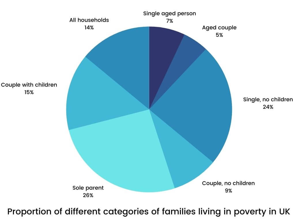
The pie chart below shows the proportion of different categories of families living in poverty in UK in 2002. Summarise the information by selecting and reporting the main features, and make comparisons where relevant.
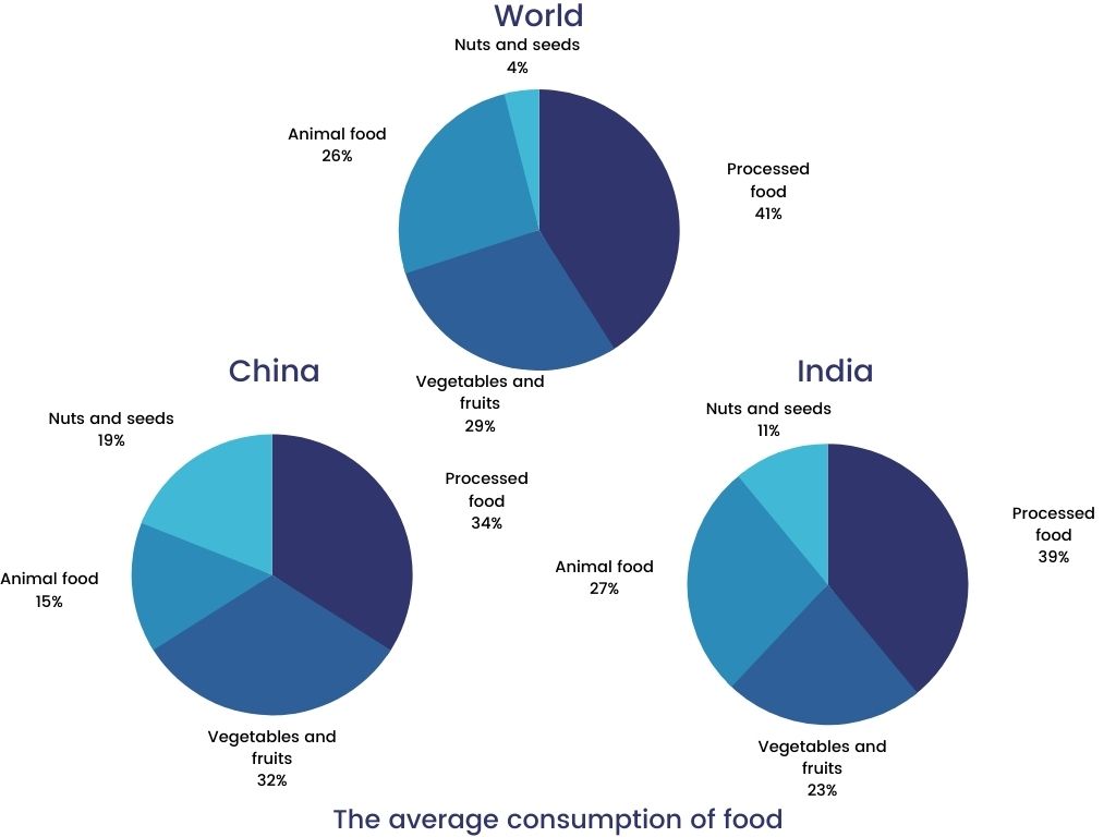
The pie charts show the average consumption of food in the world in 2008 compared to two countries; China and India. Write a report to a university lecturer describing the data.
The pie charts below show the percentage of housing owned and rented in the UK in 1991 and 2007. Summarize the information by describing the main features of the charts and making comparisons where appropriate. Write at least 150 words.

Each of these examples can help you understand how to approach similar tasks in the exam.
Vocabulary for IELTS Pie Chart Descriptions
Using the right words can enhance the clarity of your descriptions. Here are some essential terms:
- Percentages: “Nearly half” (49%), “Just over a quarter” (27%), “A small portion” (10%)
- Trends: “Increased significantly,” “Declined slightly,” “Remained constant”
- Comparisons: “The largest segment,” “The least significant portion,” “A similar percentage”
How to Write a Task 1 Pie Chart Response
Follow these steps to create an effective response:- Introduction: Paraphrase the question prompt and provide a brief overview of what the chart represents, including the time frame.
- Overview: Highlight key trends or significant features, such as the largest or smallest segments or changes over time.
- Details: Describe specific data points. Use separate paragraphs to discuss increases, decreases, or unchanged sections.
Tips for Describing Pie Charts
- Ensure your response is at least 150 words.
- Match the tense of your description with the time frame in the chart.
- Focus on the most important sections; you can omit minor details if pressed for time.
- Use varied vocabulary for proportions and percentages.
- Stick strictly to the information provided—avoid adding assumptions.
Success is the sum of small efforts repeated day in and day outBy honing your skills and using these tips, you’ll be better prepared to tackle any pie chart question in your IELTS Writing Task 1!


 Here can be your custom HTML or Shortcode
0 Comments